Veratina Kitchens
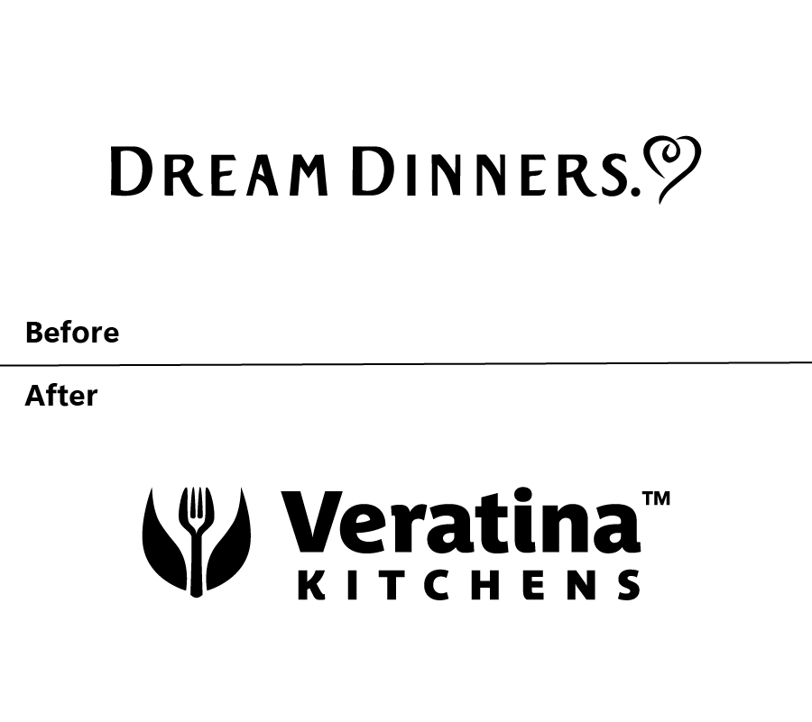
When the Dream Dinners franchise dissolved, the owner didn’t just find a new name — she built an entirely new identity. Veratina Kitchens was born from Latin roots meaning “true” and “balance,” a direct expression of her vision: chef-inspired meal prep that brings flavor, convenience, and genuine connection into everyday life. J9 Brandworks partnered to give that new vision a brand as elevated as the food itself.
True balance, rendered in a single mark.
Services
Branding & Identity Design
Industry
Food Service
Year
2026
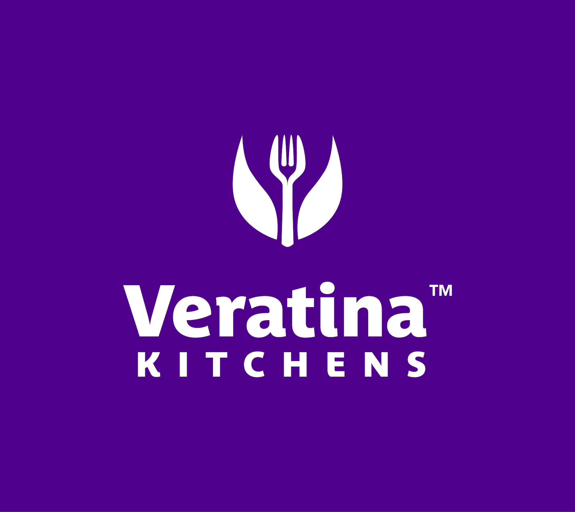
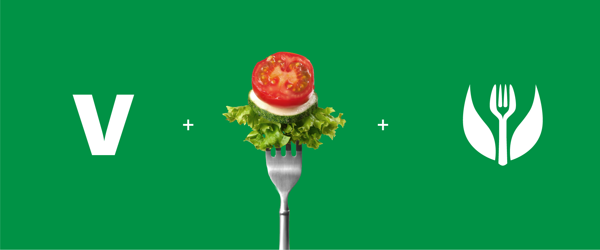
The name Veratina needed a mark that could carry the same weight — something that earned a second look. The centerpiece is a fork whose tines resolve into two rising leaves: an organic, upward-reaching form that reads as both precision and growth. Food and nature. The everyday and the elevated. At first it’s a utensil. Then it’s something more.
Paired with a refined wordmark — Veratina in confident, sculpted caps above KITCHENS — the mark creates a lockup that travels from social media avatar to delivery truck without losing a note. One cohesive identity. Clean enough to be elegant. Grounded enough to be real.
The pantry named the palette.
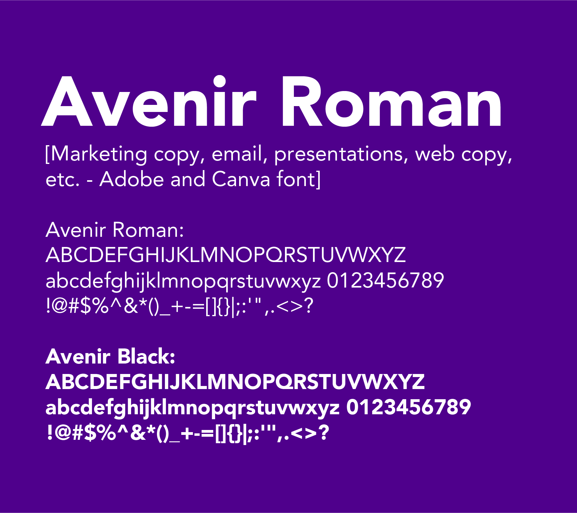
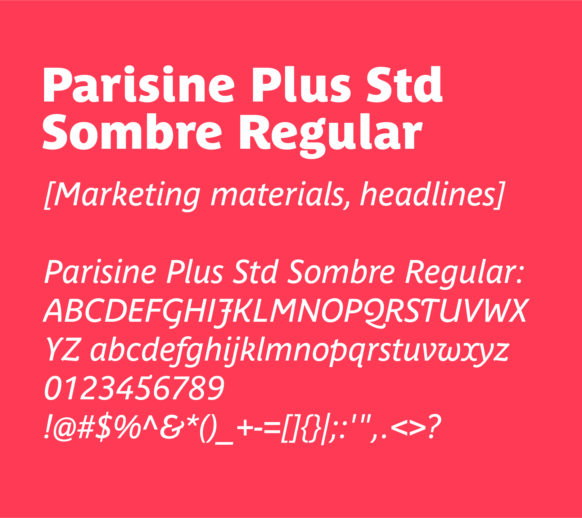
The type system pairs two voices that know when to lead and when to listen. Parisine Plus Std Sombre Regular commands the headlines — a bold, editorial face built for menus and marketing materials where presence matters. Avenir Roman handles everything else: web copy, emails, recipe cards, and anywhere warmth and clarity need to carry the conversation.
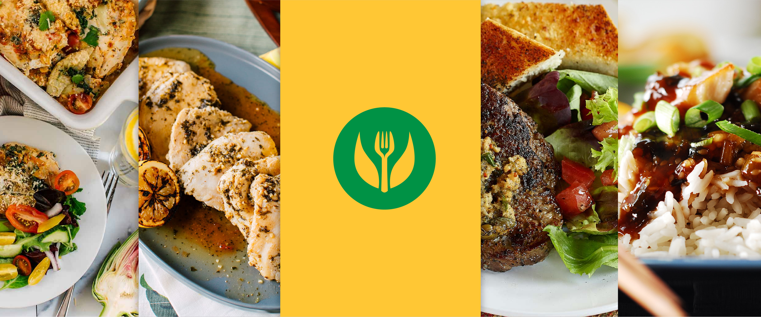
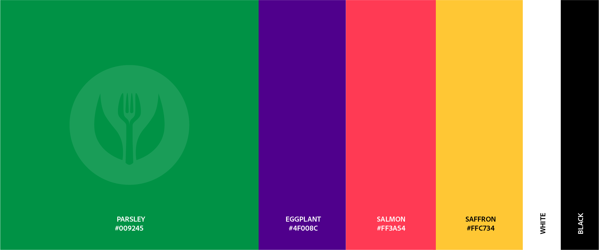
The palette takes its names straight from the pantry. Parsley anchors the brand in deep, confident green. Eggplant brings sophistication and depth. Salmon adds warmth and approach ability. Saffron punctuates with energy and light. Together with white and black, the system gives every application room to breathe — or pop — depending on what the moment calls for. Color that tells you what Veratina is before a single word is read.
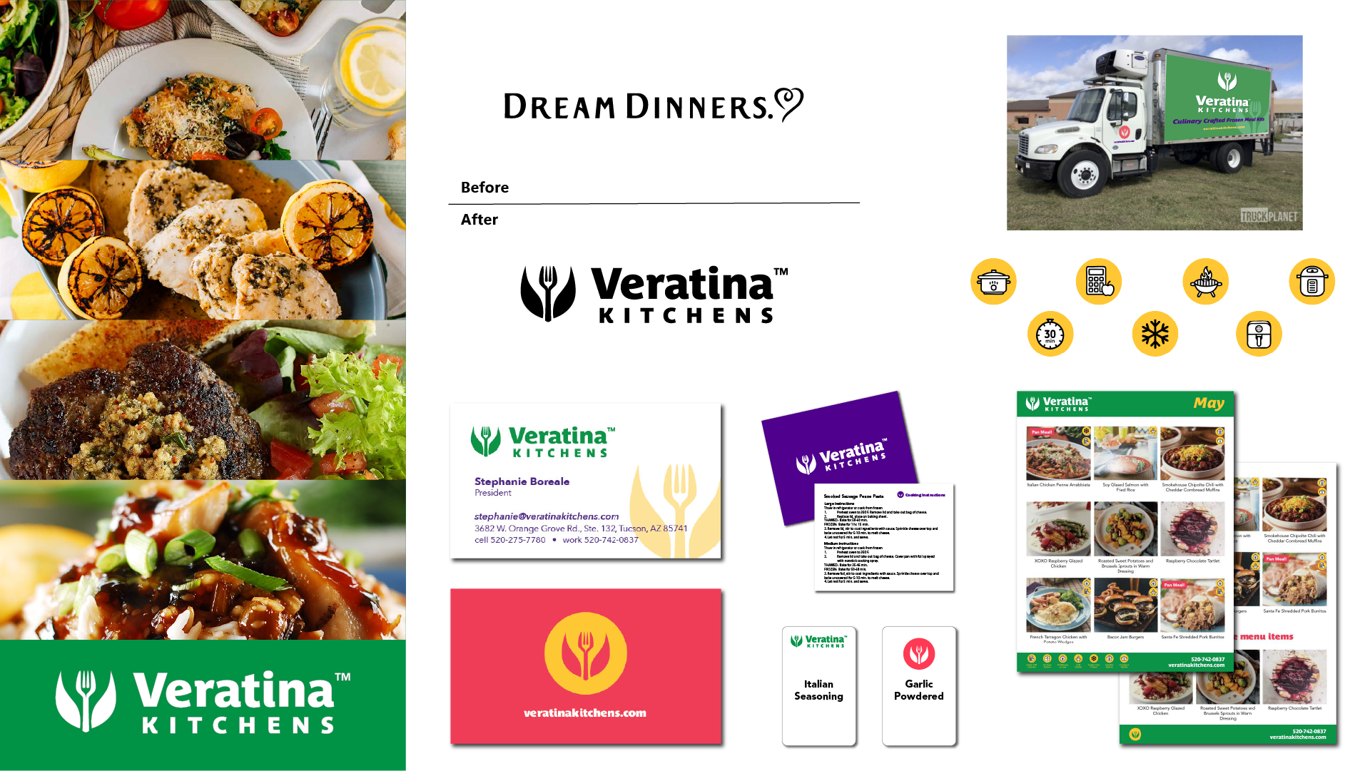
From menus and recipe cards to meal packaging, signage, and a dedicated delivery truck rolling through Arizona, the Veratina Kitchens identity was built to travel. Social media templates give the team a consistent, polished voice across every channel. Stationery and branded touch-points carry the identity into every professional exchange. One brand. Every surface. Balanced living, perfectly plated.