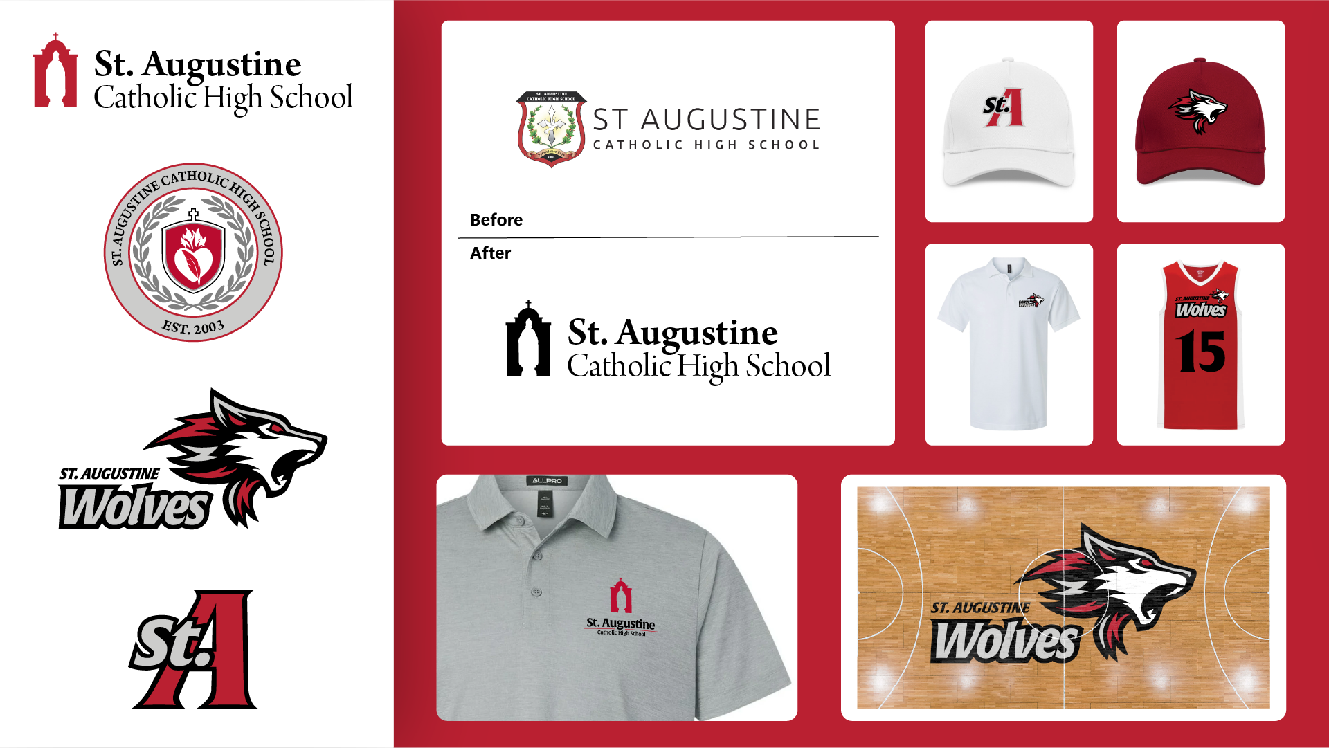

A cornerstone of Tucson’s Catholic education community since 2003, St. Augustine has built a proud academic legacy and a competitive athletic program. After more than 20 years of growth, the brand had accumulated competing marks, two different reds, and an athletic identity that no longer connected to the school’s Augustinian heart. J9 Brandworks united every mark —from the classroom to the court —under one disciplined, unmistakably St. Augustine system.
St. Augustine Catholic High School
Faith, scholarship, and pride —finally speaking with one voice.
Services
Branding & Identity Design
Industry
Education
Year
2026
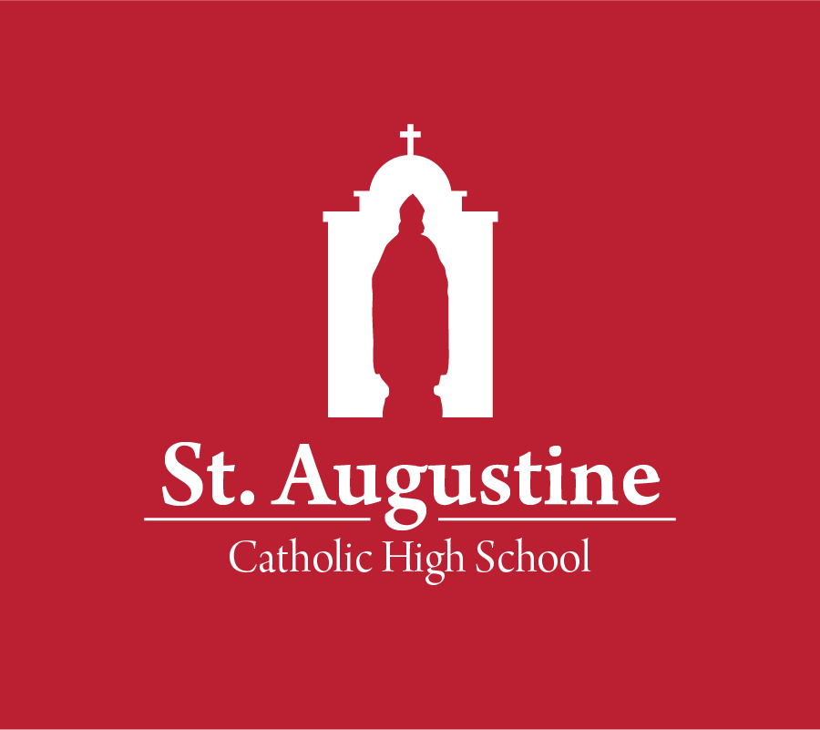
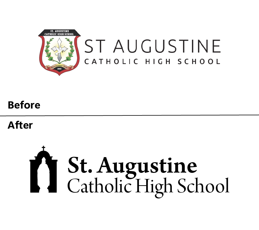
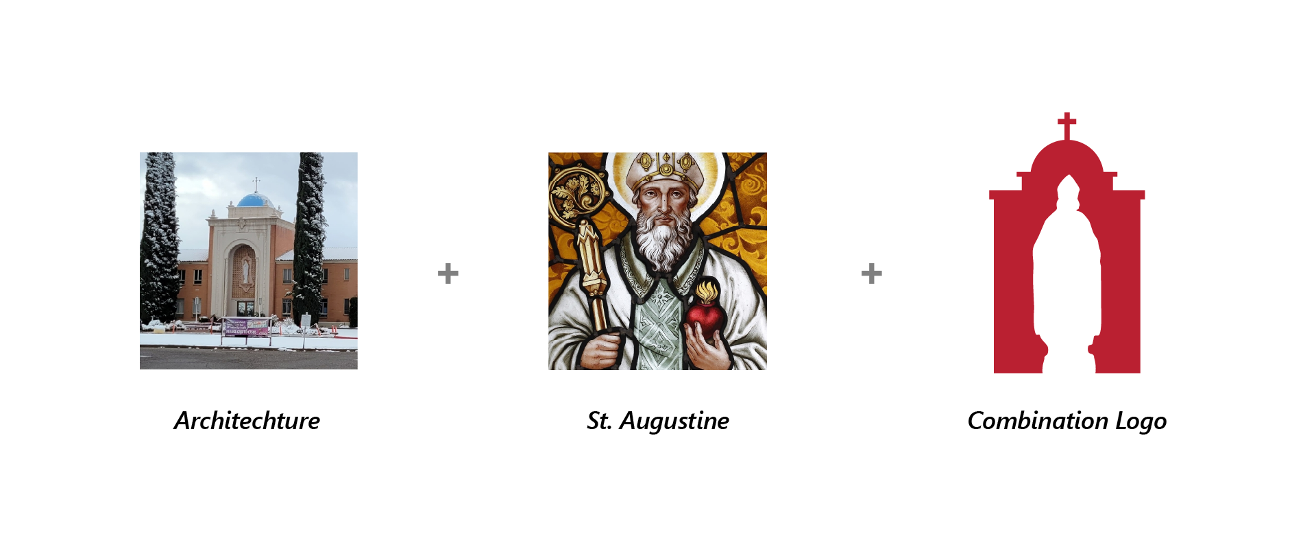
The primary academic mark draws its silhouette directly from St. Augustine’s historic main building —the dome, chapel, and entrance arch that every student, family, and alumnus instantly recognizes. Paired with the figure of St. Augustine himself, the mark roots the brand in both place and mission. The full name is set prominently: St. Augustine Catholic High School. This is a deliberate decision —one that ensures the school is never confused with St. Augustine Cathedral downtown, and that reinforces Catholic identity as a defining part of how the school presents itself, not a footnote.
Typography that carries the weight of tradition.
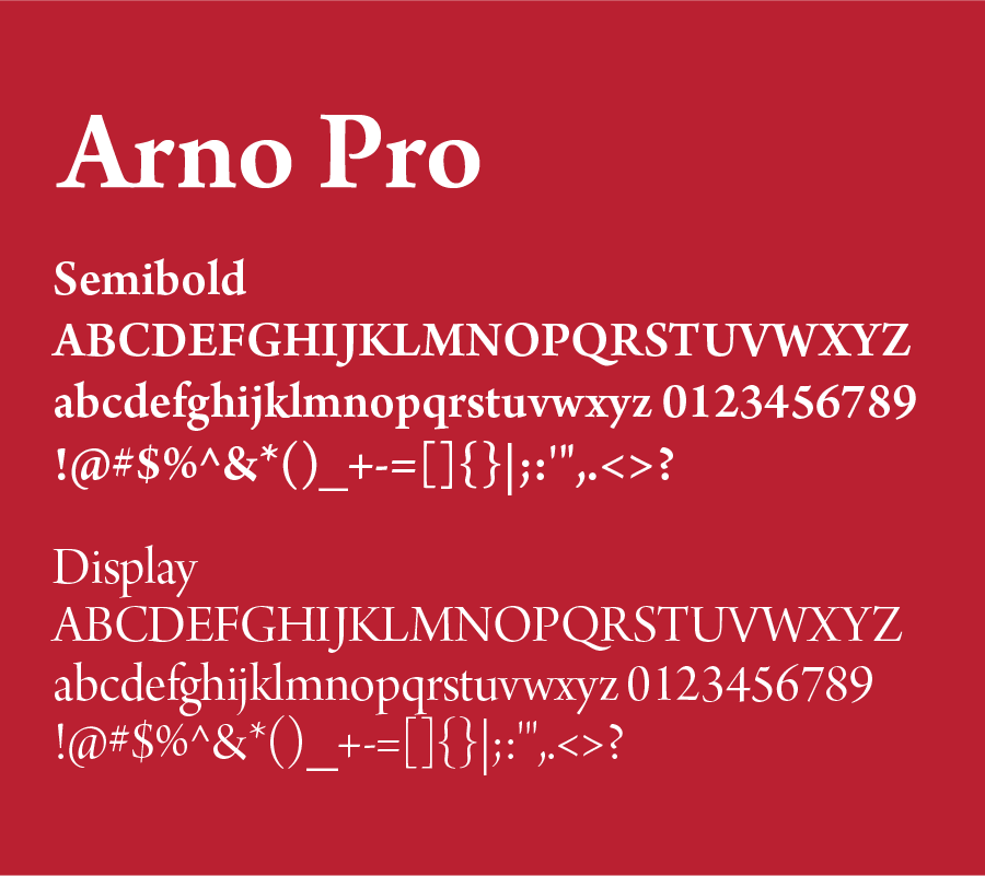
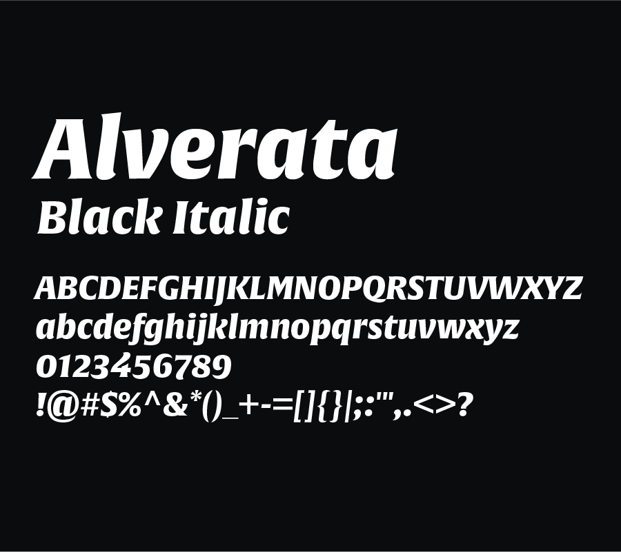
Arno Pro carries the academic mark. A classical serif with strong roman authority, it gives the wordmark the gravity that a 20-year institution deserves —scholarly, refined, and built to read cleanly at any size. It lives in the logo only where the universal font, Garamond, is used in everyday brand communications.For athletics, Alverata Black Italic gives the Wolves wordmark and the St. A monogram the weight and motion their context demands —bold enough for a jersey, disciplined enough to sit alongside the academic mark without competing with it.
Gallery of Food had outgrown a brand built around its bodega in 1991. We pulled the parent name back to the center with a refreshed script, slipped a paintbrush into the wordmark in place of a fork, and built a family system that lets Bodega, Café, and Catering each have their own personality. The new palette is named for the ingredients themselves —Clove, Saffron, Paprika, Sage, Butternut —and the two type families (Bodega and Plantin) read like a well-set table: contemporary and rooted, sharp and welcoming.
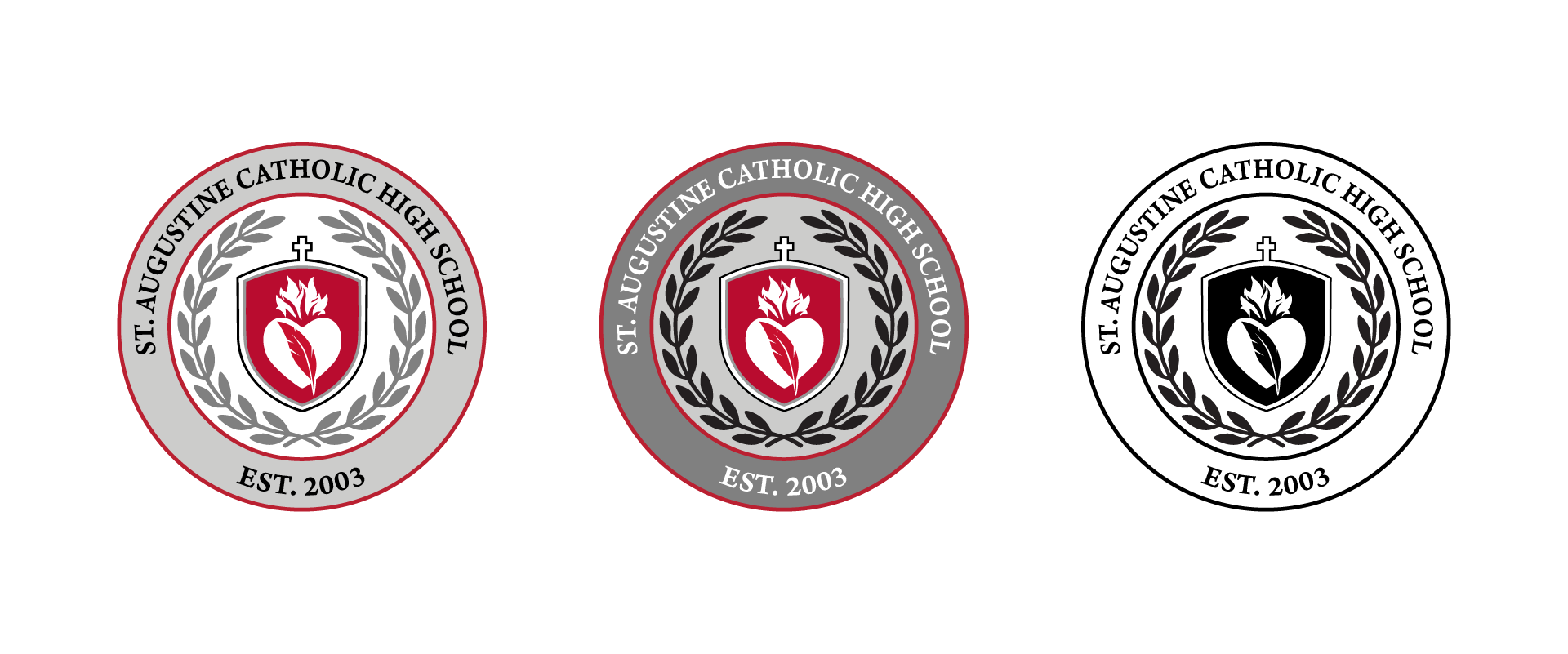
The seal gathers three meaningful symbols into a single, balanced composition. The flaming heart is drawn from the Prayer of St. Augustine —“Our hearts are restless until they rest in You” —and signals the spiritual fire at the center of the school’s mission. The quill, frequently depicted in classical imagery of the saint, speaks to scholarship, writing, and the life of the mind. Together they pair faith and learning in one image. Framing the badge are olive leaves —a quiet nod to the olive trees that shade the school’s courtyard, tying the mark to a specific, lived-in place on campus and adding a note of peace and growth that complements the Augustinian story.
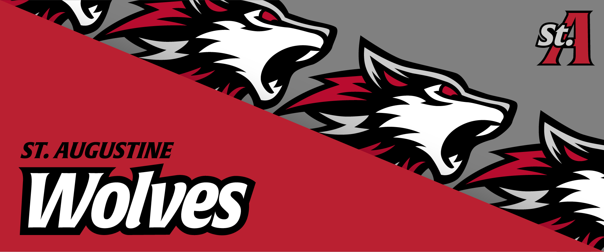

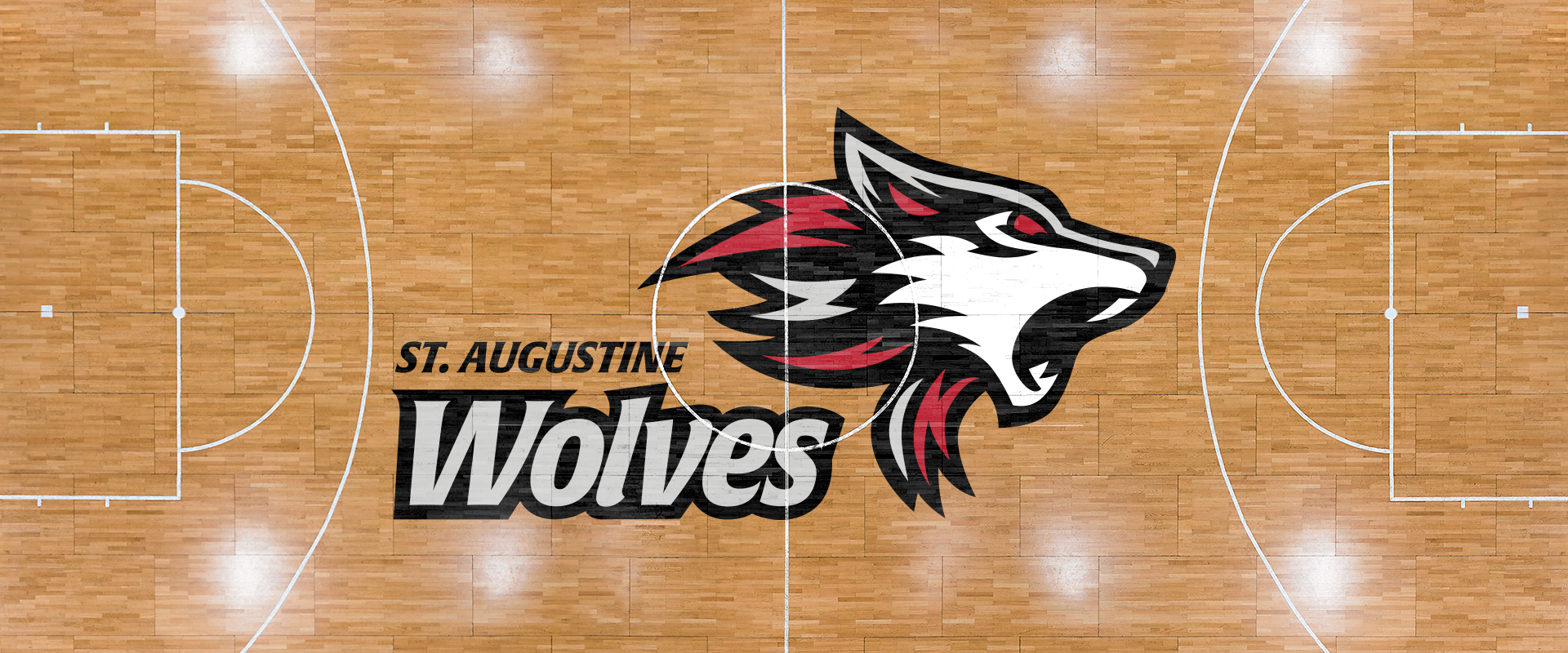
A wolf in motion. Fire in the mane. One pack.
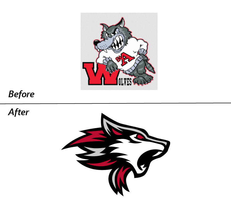
The original wolf mascot had character —but it read more like a cartoon than a mark. It had grown out of step with a school that had matured around it, and it didn’t carry any visual connection to the Catholic, Augustinian identity it represented.
The new wolf is a clean, confident silhouette mid-stride, with the mane rendered as flame —a direct visual echo of the flaming heart in the academic badge. The fire is the thread. It appears in the seal, in the badge, and now in the mascot, so the brand speaks as one family across every surface: classroom, gym, and gym floor.Student feedback shaped this mark at every stage. Earlier rounds consistently favored silhouettes that read as howling —calling the pack together. That direction informed the final mark: a wolf with presence, motion, and a reason behind it.
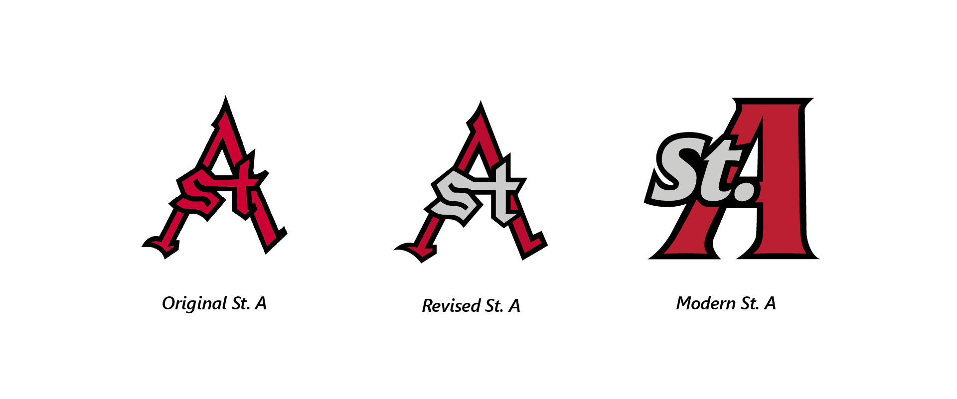
The St. A monogram has a history worth keeping. The original mark was cleaned up and preserved as a throwback option —a nod to where the school has been, available for heritage applications and alumni use. But St. Augustine needed a mark that could carry the brand forward: the new St. A is built in the same custom letterforms as the Wolves wordmark, with a subtle forward skew that gives it motion and edge. It reads as unmistakably theirs —not borrowed from tradition, but grown from it.
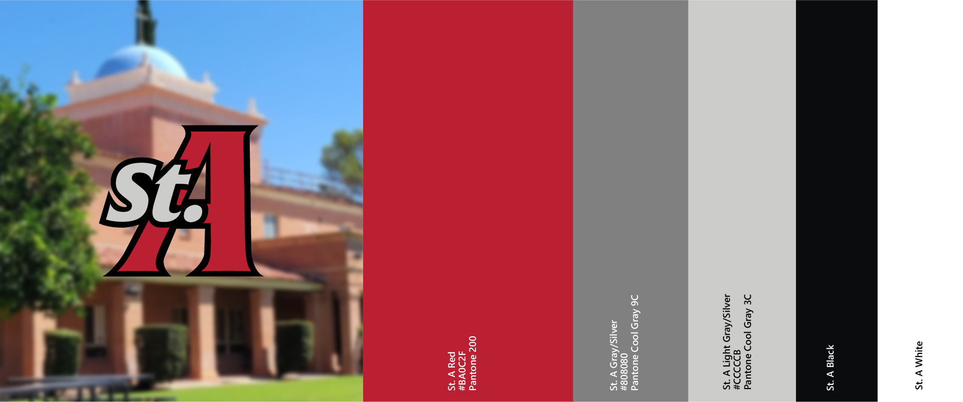
The color palette is the most personal part of the rebrand. The previous identity had allowed two competing reds to accumulate over time —neither definitively St. Augustine’s. The new system makes a clear choice: one primary Scarlet, named and owned. Silver and Black complete the palette, returning to the school’s true colors with new conviction.