
Applied Nanotech
Applied Nanotech develops the novel nano-materials and processes behind some of the most demanding work in microelectronics, defense, high-energy physics, and nuclear energy. After a change in ownership, the company needed a brand that matched the precision and ambition of the science — without disrupting the website and equity they’d already built.
One name. One mark. Engineered like the science it represents.
Services
Branding & Identity Design
Industry
Technology
Year
2025
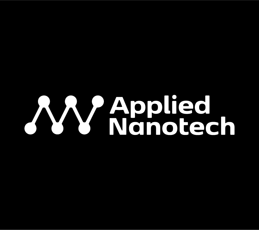
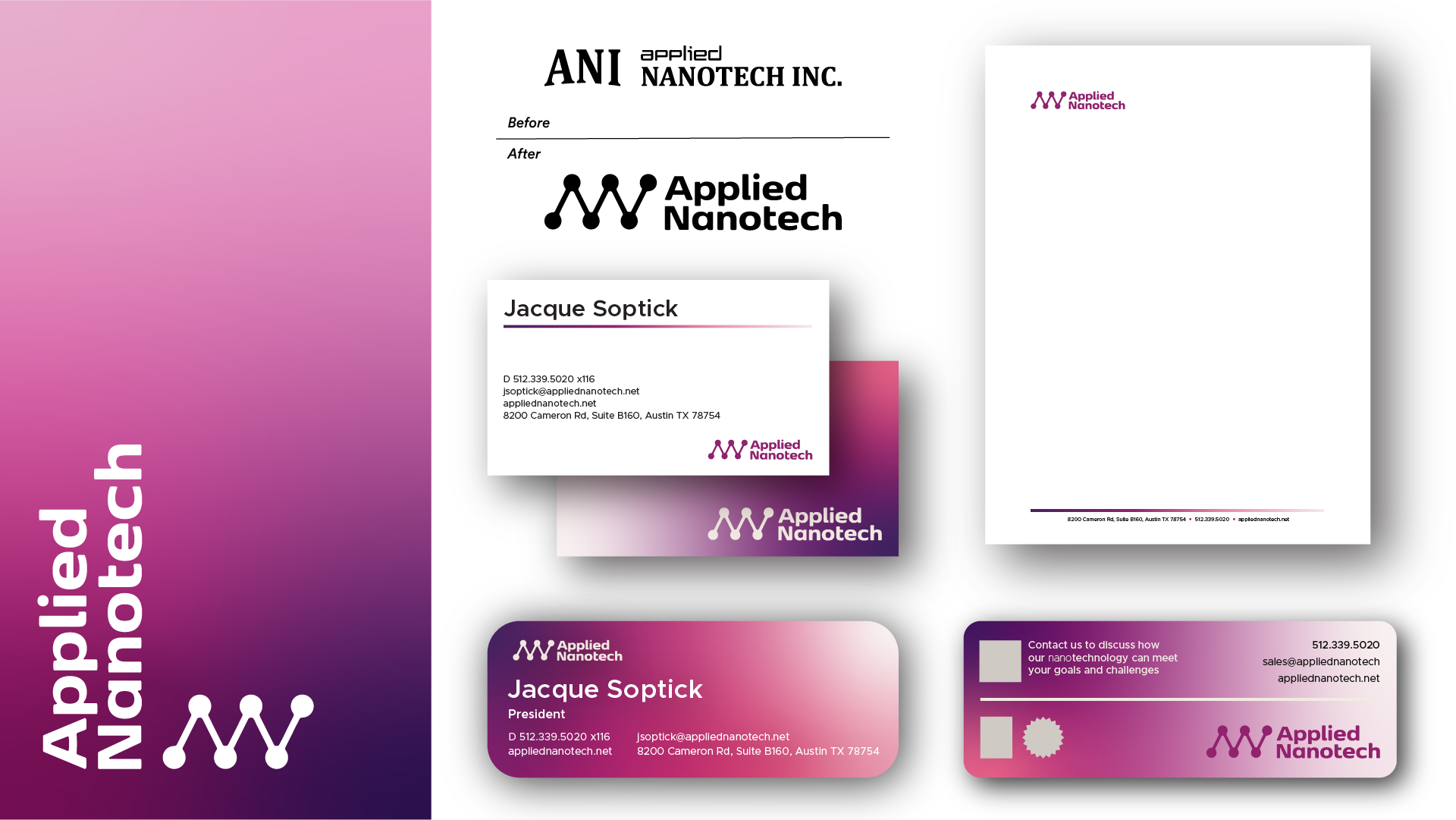
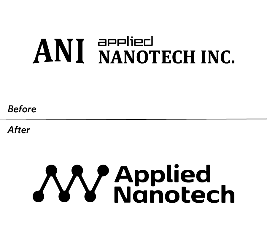
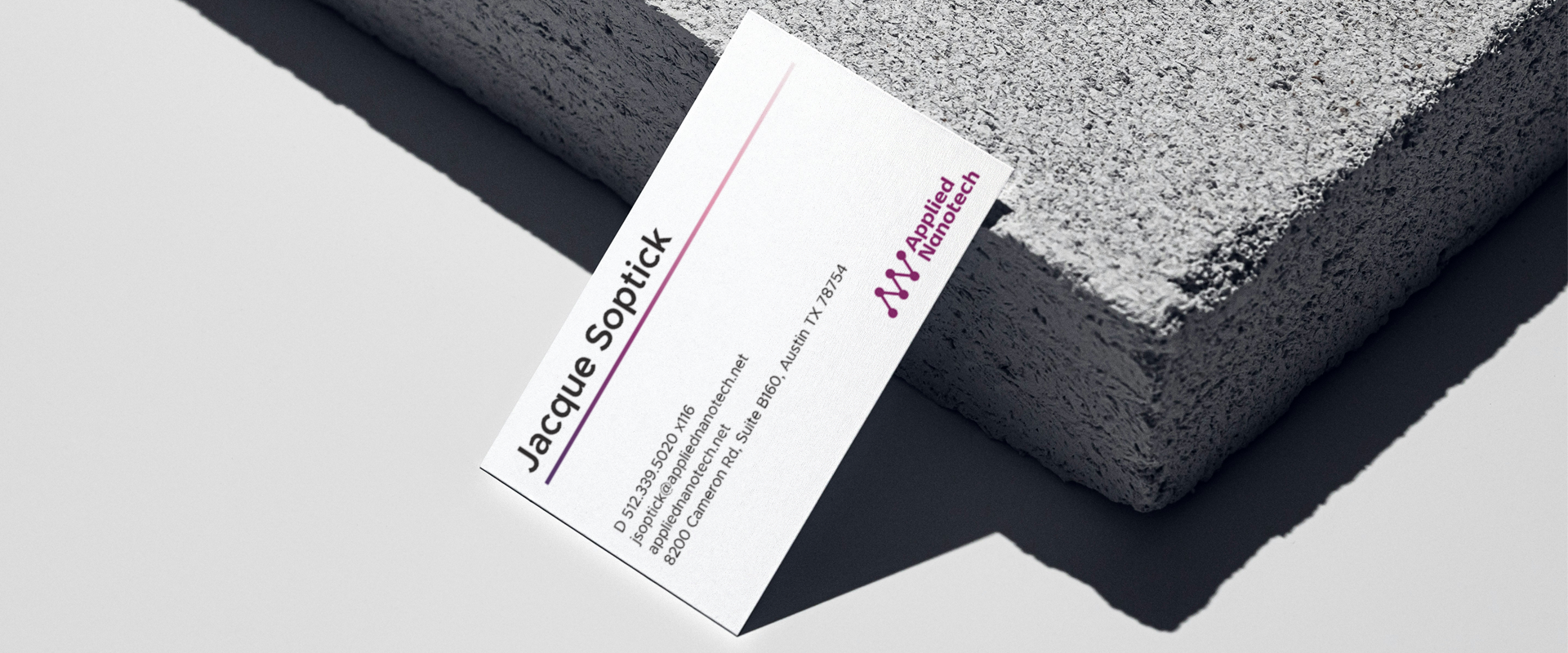
The previous identity carried colors and conventions from a prior ownership era and a name that competed with itself — “ANI” stacked beside “Applied Nanotech Inc.” on a single mark. We simplified the verbal identity to a confident, singular phrase: Applied Nanotech. The new symbol does double duty, forming the letters A and N from the nodal connections that define nanoscale technology — a small visual cue that quietly tells the company’s story every time the logo appears.
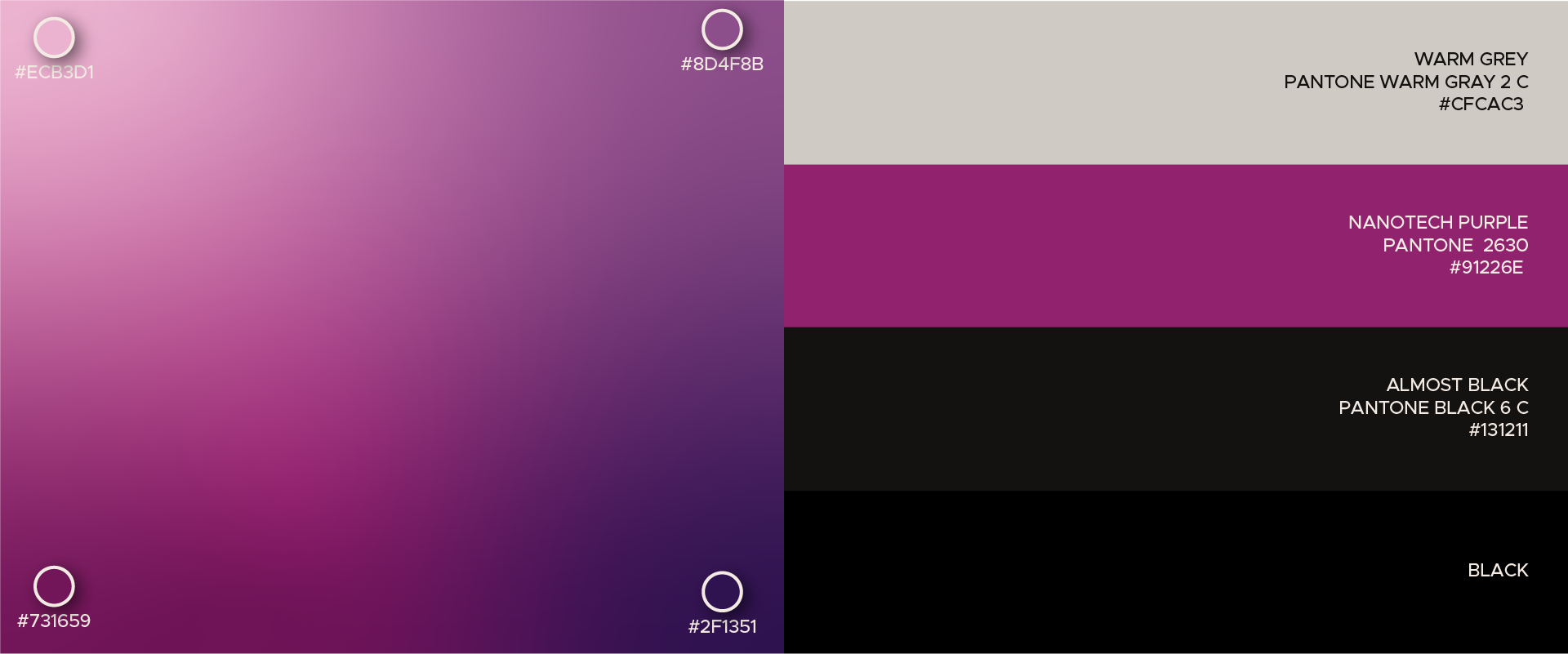
Color was the next decision. Rather than walking away from the equity in the existing site, we chose a richer, more distinctive violet — Nanotech Purple — that honors the brand’s history while giving it a hue that’s unmistakably its own. A gradient palette extends the system across digital surfaces and adds dimension without ever feeling decorative, so the new identity dropped into the live site as a refinement, not a rebuild.

A type system as exacting as the work it carries.
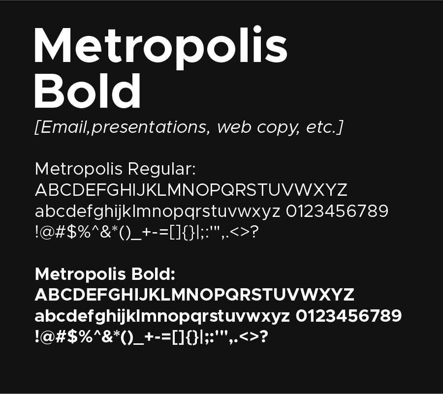
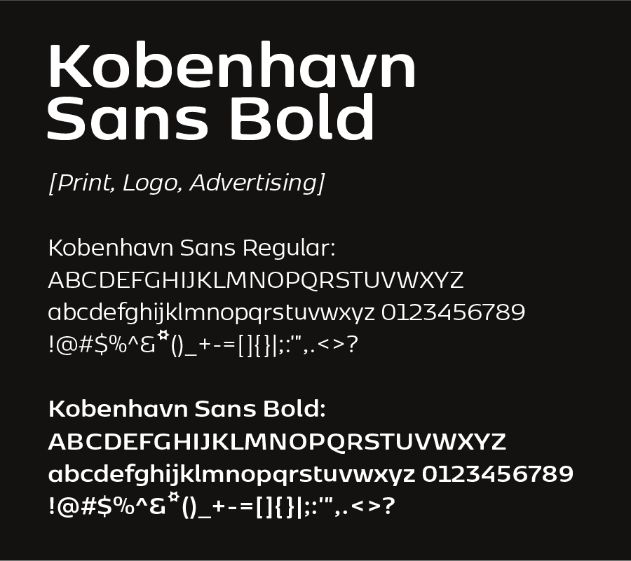
Kobenhavn was selected for the logotype and printed collateral. Its geometry stays close to the typography already in use on the website, so the rebrand reads as an evolution rather than a reset — and its precision suits a company whose work is measured in nanometers.
Metropolis takes over for email, presentations, and web copy. It’s clean, highly legible at small sizes, and renders consistently across every channel the team uses to communicate with OEM and government partners. Together, the two faces give Applied Nanotech a system that’s polished in print and clear on screen — without over designing either.
Applied Nanotech inherited a brand from a previous era of ownership — a name that competed with itself and a color borrowed from a prior identity. We simplified the wordmark to a single phrase, designed a symbol that draws the letters A and N from nanoscale connection points, and chose a richer, ownable violet that respects the equity already built into the live site. The result is a brand system that drops into the existing website as a clear, confident upgrade — not a disruption.