Saint Augustine Cathedral is the mother church of the Diocese of Tucson, newly returned to its original splendor after a full restoration.
The building had been restored. The brand needed the same care—a return to what was always there.

A restoration, not a reinvention.
The challenge
Tucson's Spanish mission church has long carried the region's Catholic imagery. Saint Augustine's restored ornament revealed a different hand—the painting, pattern and craftsmanship of its French founders.
The cathedral needed an identity drawn from its own building, and a system strong enough to hold every ministry under one roof without any of them drifting into a mark of its own.

The approach
Nothing was invented. We took the palette, the ornament and the silhouette directly from the cathedral, then wrote the rules that keep them whole.
The twin towers crown the wordmark. Seven colors come from the glass, stone, copper, stucco, textiles, gilding and iron. Three faces carry the type: one for display, one for reading, one for letterspaced capitals.
 Tucson

The mark and its family
Three lockups, chosen by the shape of the space, never by preference. Around them, three ornaments lifted from the building itself.
The Flaming Heart comes from the sanctuary ceiling—a devotion that reached the Sonoran desert from France by way of Santa Fe. The cross-fleury and small cross echo the French patterns stenciled into the exterior.




Every group belongs to the cathedral. The ministry name takes the place of the tagline—same position, same size, same tracking—and no ministry gets a mark of its own.
In the world
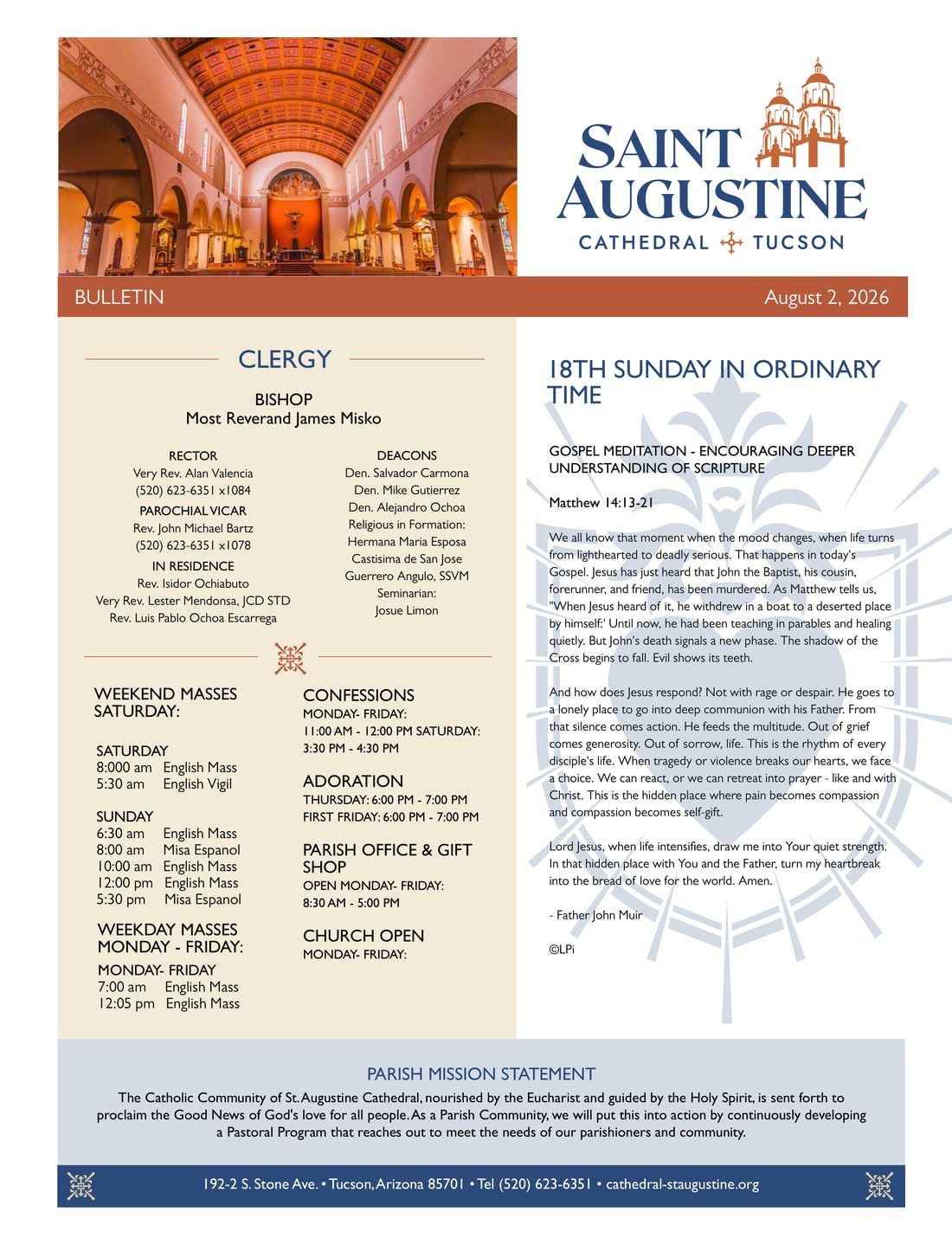
Letterhead, business cards and note cards on warm cream stock, each carrying the Flaming Heart as a pale watermark. The weekly bulletin and the entrance sign carry the same lockup.

The Flaming Heart in Desert Sand on a Stained Glass disc, reserved for social profiles where the frame is a circle.

Delivered as a twelve-page guideline and a 128-file asset package—vector SVG and transparent PNG—through the J9 Brandworks client portal.
About the client portal